代码目的
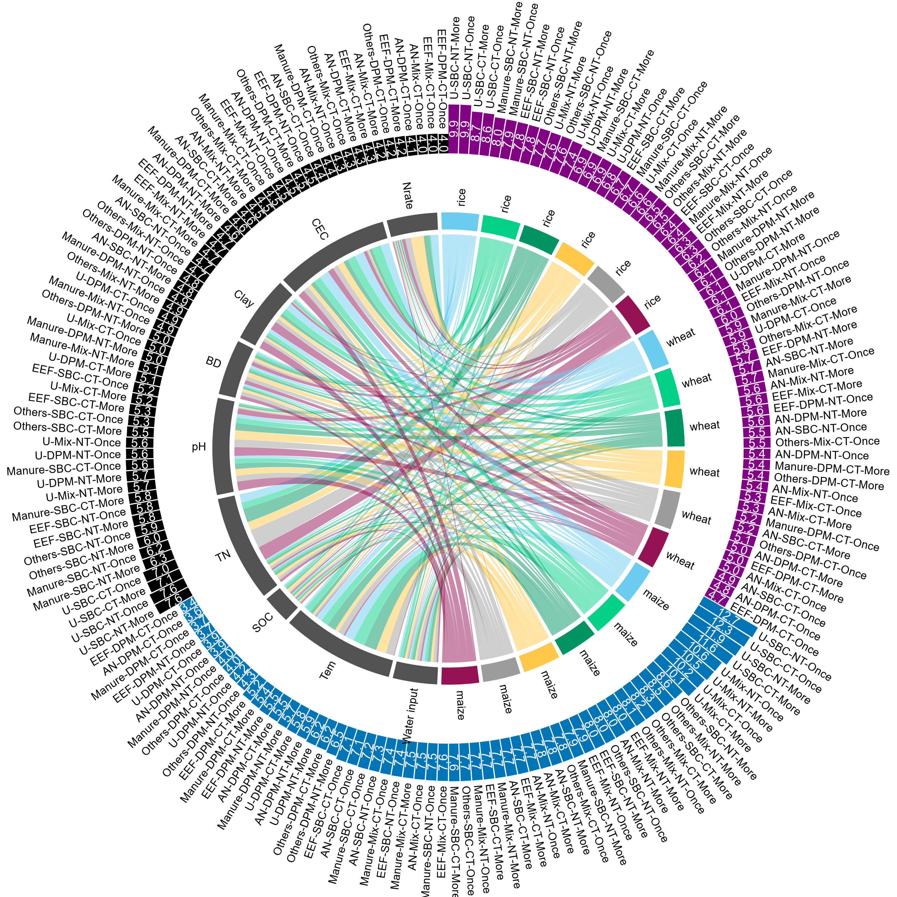
- 和弦图 (Chord Diagram) 可以清晰地显示复杂的数据交互,尤其适用于展示多个类别之间的关系和交叉。
- 外围环绕条形图是对和弦图的补充,这篇文章显示的是不同管理实践类型下的效率,这样就能与和弦图中的变量一起揭示规律了。
代码
setwd("D:/生信代码复现/顶刊和弦图")
library(tidyverse)
library(circlize)
library(grid)
library(circlize)
library(ggplotify)
data1 <- readxl::read_xlsx("41586_2024_7020_MOESM4_ESM.xlsx", sheet = "The inner cycle")
data2 <- readxl::read_xlsx("41586_2024_7020_MOESM4_ESM.xlsx", sheet = "The outer cycle")
last_col_name <- names(data1)[ncol(data1)]
data1 <- data1 %>%
column_to_rownames(var = last_col_name)
data1_matrix <- as.matrix(data1)
head(data1_matrix)
data2 <- data2 %>%
mutate(Species = sub("^([^-]+).*", "\\1", `Ctype-Management practices`),
Type = sub("^[^-]+-(.*)$", "\\1", `Ctype-Management practices`))
head(data2)
color_region = c("#6BCCEF", "#00D187", "#009462", "#FDC848", "#9C9C9C", "#951255")
color_species = c("#810084", "#0075B6", "#000000")
circos.clear()
circos.par(start.degree = 90, circle.margin = c(0.6, 0.6, 0.6, 0.6))
chordDiagram(data1_matrix,
annotationTrack = "grid",
transparency = 0.5,
annotationTrackHeight = 0.07,
preAllocateTracks = list(track.height = 0.005),
big.gap = 1, small.gap = 1,
grid.col = c(rep(color_region, 3), rep("#525252", 9)))
circos.track(track.index = 1, panel.fun = function(x, y) {
sector_name <- CELL_META$sector.index
sector_name <- sub(".*-", "", sector_name)
circos.text(CELL_META$xcenter, CELL_META$ylim[2], sector_name,
facing = "clockwise", niceFacing = TRUE, adj = c(0, 0.5), cex = 0.75)
}, bg.border = NA)
create_chord_plot <- function(data1_matrix, data2, color_region) {
circos.clear()
circos.par(start.degree = 90, circle.margin = c(0.6, 0.6, 0.6, 0.6))
chordDiagram(data1_matrix,
annotationTrack = "grid",
transparency = 0.5,
annotationTrackHeight = 0.07,
preAllocateTracks = list(track.height = 0.005),
big.gap = 1, small.gap = 1,
grid.col = c(rep(color_region, 3), rep("#525252", 9)))
circos.track(track.index = 1, panel.fun = function(x, y) {
sector_name <- CELL_META$sector.index
sector_name <- sub(".*-", "", sector_name)
circos.text(CELL_META$xcenter, CELL_META$ylim[2], sector_name,
facing = "clockwise", niceFacing = TRUE, adj = c(0, 0.5), cex = 0.75)
}, bg.border = NA)
}
par(mar = c(1, 1, 1, 1))
par(asp = 1)
p1 <- as.ggplot(expression({
create_chord_plot(data1_matrix, data2, color_region)
}))
print(p1)
p1
data2 <- data2 %>%
group_by(Species) %>%
arrange(Species, desc(`EF_mean (%)`), `Ctype-Management practices`) %>%
ungroup() %>%
mutate(ID = seq(1, nrow(data2)))
angle <- 90 - 360 * (data2$ID-0.5) /nrow(data2)
data2$hjust <- ifelse( angle < -90, 1, 0)
data2$angle <- ifelse(angle < -90, angle+180, angle)
p2 <- ggplot(data2, aes(x = ID,
y = `EF_mean (%)`)) +
geom_bar(stat = "identity", aes(fill = Species)) +
coord_polar() +
ylim(-60, max(data2$`EF_mean (%)`)+6) +
scale_fill_manual(values = color_species) +
theme_void() +
theme(legend.position = "none",
plot.margin = unit(c(-1,-1,-1,-1), "cm")) +
geom_text(aes(y = `EF_mean (%)`+1, label = Type, hjust=hjust),
angle= data2$angle, size = 3.2) +
geom_text(aes(y = `EF_mean (%)`/2, label = sprintf("%.1f", `EF_mean (%)`)),
angle= data2$angle, size = 3.5, color = "white")
p2
legend(x = -1.855, y = 1.8, , legend = c("Maize", "Rice","Wheat"), fill = color_species,
border = "white", bty = "n", x.intersp = 0.2, y.intersp = 0.55,
title = "Outer circle", title.adj = 0.4, title.font = 2,
cex = 0.75)
legend(x = -1.82, y = 1.5, legend = c("South America",
"Africa", "Asia",
"Oceania", "North America", "Europe", "Driver"),
fill = c(color_region, "#525252"),
border = "white", bty = "n", x.intersp = 0.2, y.intersp = 0.55,
title = "Inner circle", title.adj = 0.16, title.font = 2,
cex = 0.75)
library(cowplot)
library(grid)
ggdraw()+
draw_plot(p2)+
draw_plot(p1,x = 0, y = 0,
width = 1, height = 1)
ggsave("./20241127_和弦图.jpg",width = 10,height = 10)
复现出图